The Sweet ReTreat – A candy store!
Teh Sweet ReTreat Logo contains both a clean and simplistic lollipop and ice cream cone with candy dots underneath. The font is readable cursive that
is supposed to portray a warm and welcoming atmosphere to potential customers. One of the nuanes of the shop title font is that the first "T" in the word retreat is
capitalized. This is a slight play-on-words displaying the fact that there are (you guessed it) treates within the sweet retreat. Furthermore, the logo is designed to embody
the simplicity of the concept itself. Meaning that it was important to have a clean and uncluttered design to match with the warm, unhindered atmosphere of
the store concept. In other words the last thing a logo for a "sweet retreat" should be is loud. The idea was to create an almost small town, bookstore-like
environment for an ice cream and candy shop and there is no doubt that this logo coincides with the aforementioned attitude.
The color scheme is also vital to the concept of the sweet retreat. The logo is colorful but without being too vivid or too bland. The colors add to the understated
nature of the logo further showing that the sweet retreat is a clean and friendly place; perfect for bringing your children on the weekend or after school. There is
certainly an aspect of neighborhood sentimentality presented by the Sweet ReTreat, created to contrast with the age of multi-national chains. Overall, the Sweet ReTreat logo
is original, simple and made to appeal to the average American candy and ice cream shop consumer.
Unfortunately, my hard drive crash in September and I permanently lost my Sweet Retreat logo! Stay tuned to see a remake of it!
Sawdust Art Festival
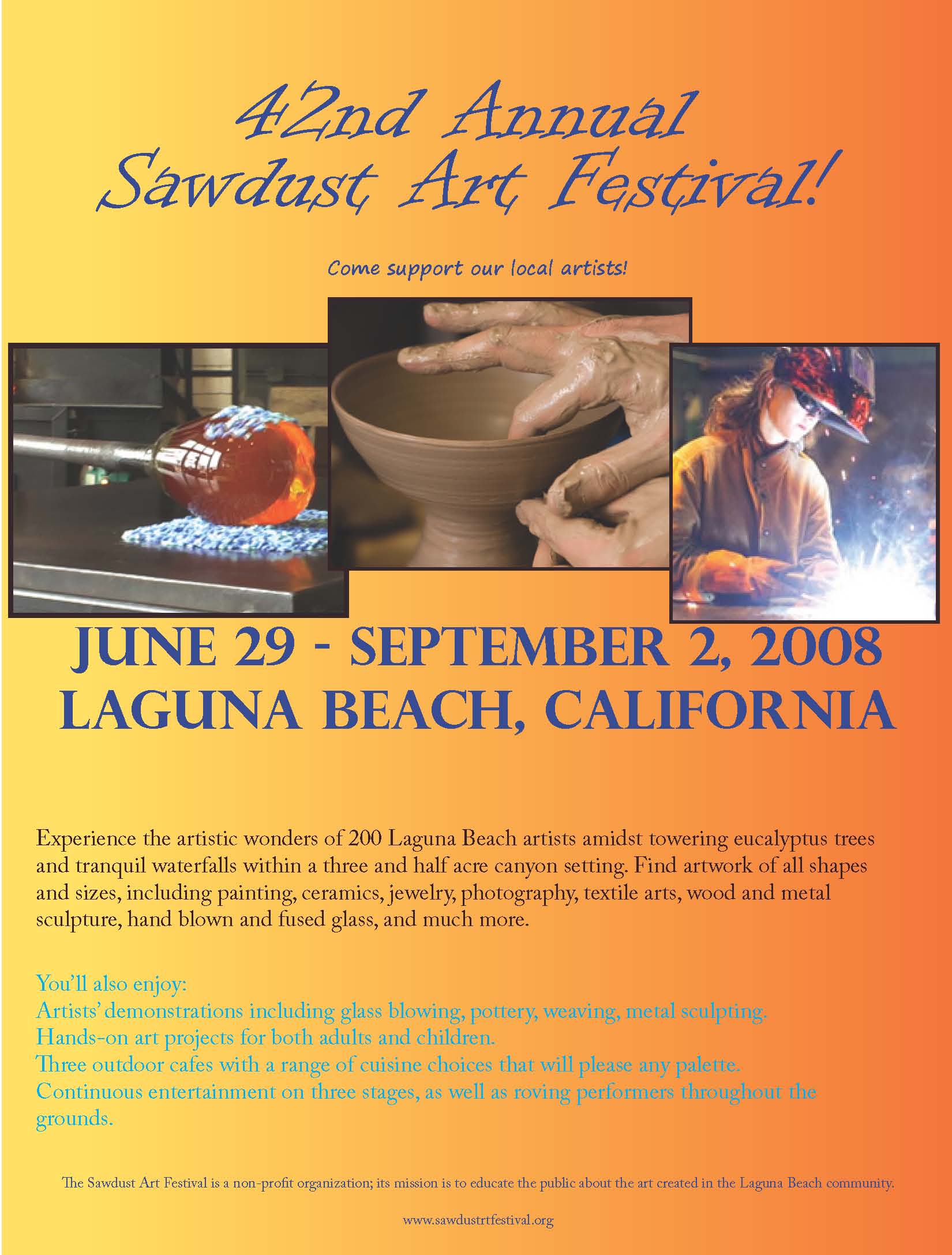 On my poster for the Sawdust Art Festival I went for a collage theme as the main attraction. When I see posters with graphics I do not always connect to them like I
do to posters with photographs. Some of the main attractions at the event were glass blowing, poetry and metal sculpting so I decided to incorporate
these into the poster. I think this will allow the viewer to actually understand just what they will be able to experience if they go to the festival!
The font as the top of the poster that says, "42nd Annual Art Festival" is in a fun, whimsical font that catches the eye of the viewer. Furthermore, I used different fonts for all the texts on the
poster because I felt that it made each one important in its own way. In the background is a yellow and orange gradient. These colors are not only two of my favorite, but they also make the text and photos stand out.
The contrast of navy blue font against a yellow and orange gradient background pops off the page!
The website is smaller at the bottom because I did not want people
to just see the website and think to themselves that they will look at it later. That usually is never the case. I wanted the viewers to continue reading about all the exciting things that the
festival offers in order to keep them intrigued.
Menu – Hollywood Sandwich Shoppe
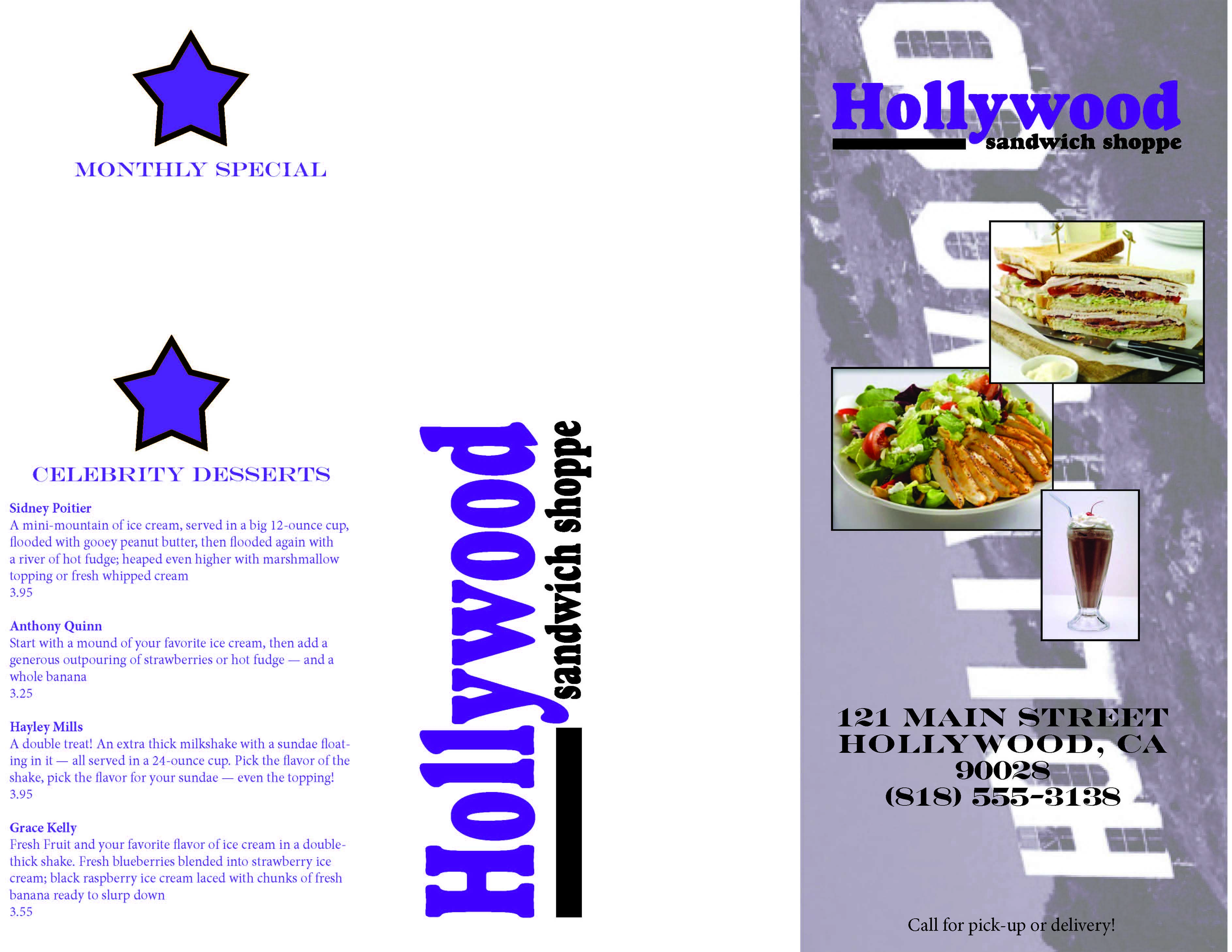
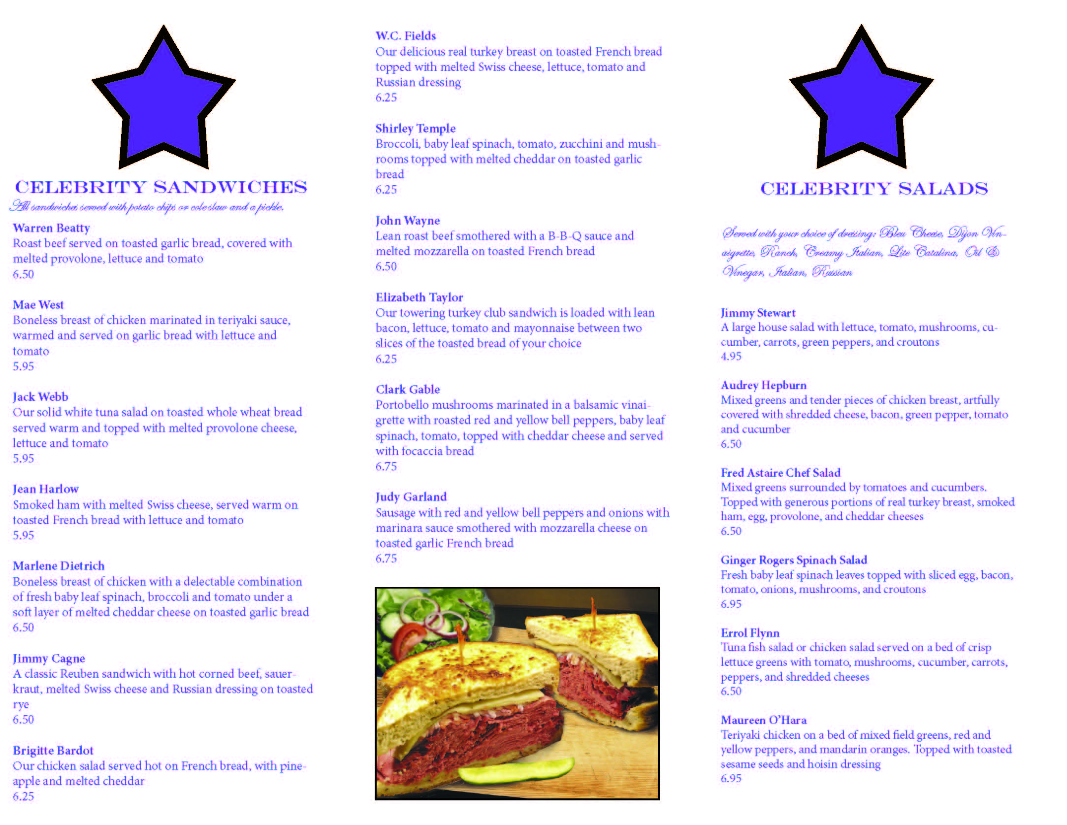
When I was making the menu for the Hollywood Sandwich Shoppe, I tried to keep in mind that this had to be printed in black and white. Even though I used dark purple in the menu
to accent the logo, it can still be printed in black and white and looks great. (I tried it on my printer).
On the first page, I found a photo of the iconic Hollywood sign and edited it in photoshop. I changed it to grayscale, and then duotone, with a dark purple and black
contrast. Then I changed it to RGB color so that I could save it as a JPEG. I used this in the background of the first poage to give the menu some flair.
I also added a few photos of some of the menu options because it would illustrate to people what kind of food they have. I had them layered on top of each
other to give a "scrapbook" effect and as to not take away from the Hollywood sign in the background.
One each section of the menu I made a dark purple star to match the logo with a black border. Again, this will look fine in black and white as I have already tested
it. I like to have continuity in my work, so I wanted to have each section match. I bolded each of the celebrities names to make it jump from the page but I kept the
description and price unbolded.
The Monthly Special section has a place for the celebrity's face in the star! I thought this would be a neat way to have this section differentiate from the others.
The options for the salads and sandwiches are italicizecdd and in a smaller font since they are not big aspects of the meal.
A picture of a "John Wayne" sandwich is at the end of the Celebrity Sandwich because I thought it was an aestheitcally pleasing photograph that complimented the text.
Calendar – with Cute Animals!
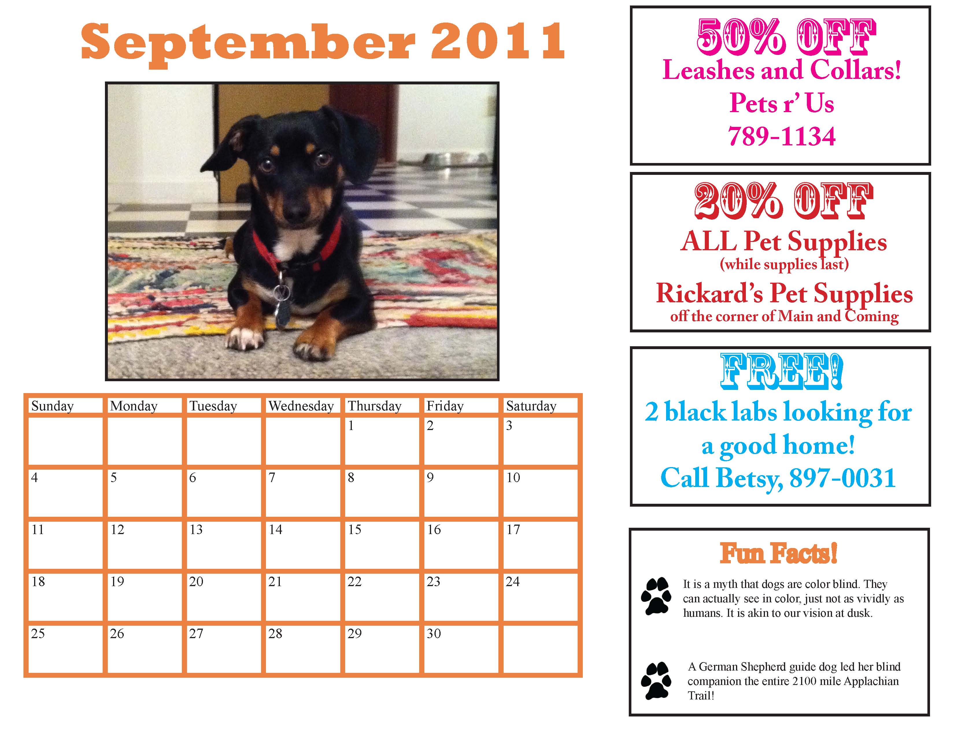
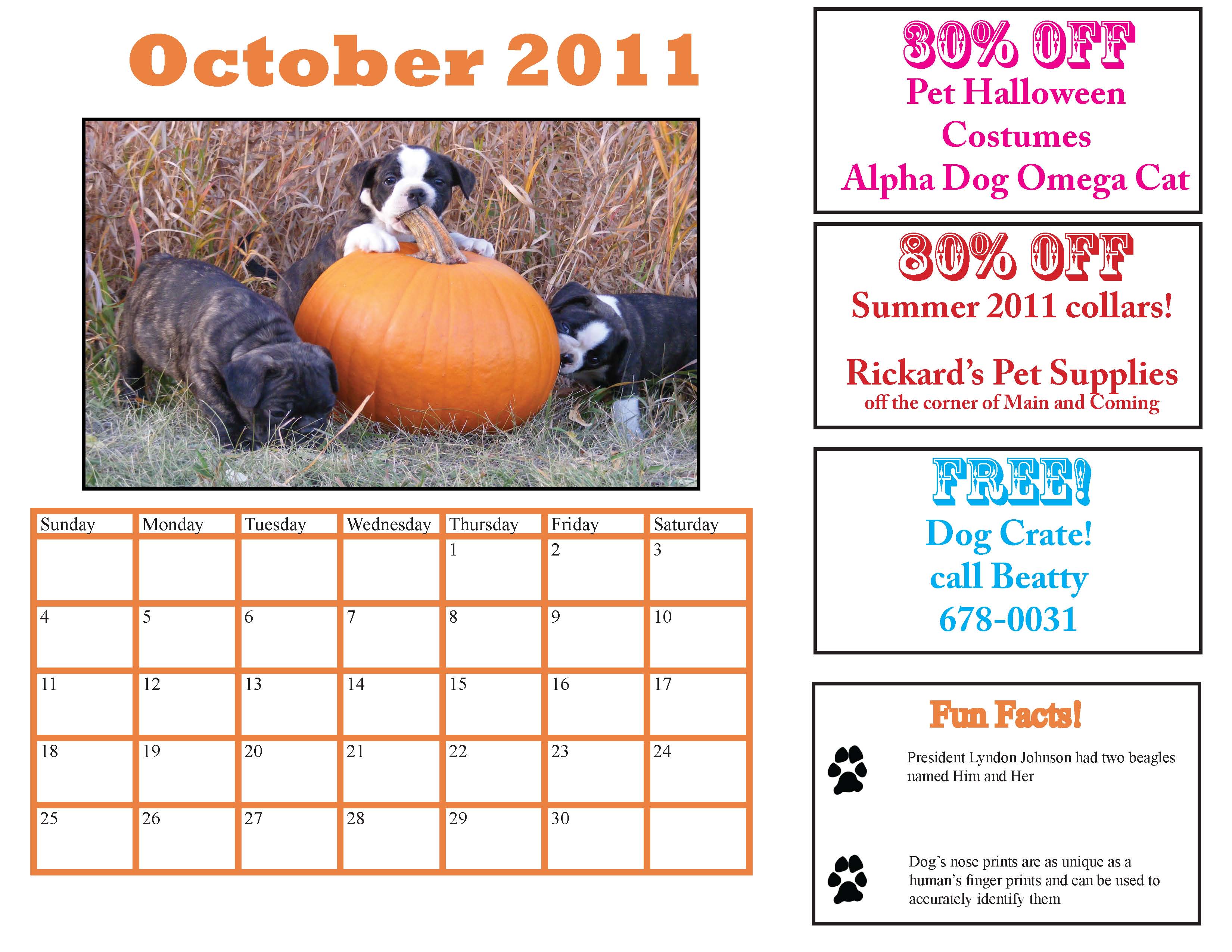 This was by far my favorite assignment! Making calendars is not as hard as it looks! September features my handsome dog Fritz sitting at the top of our stairs!
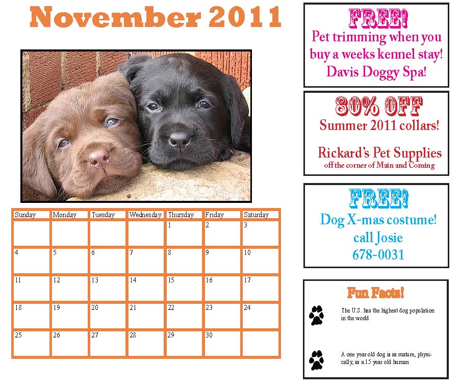
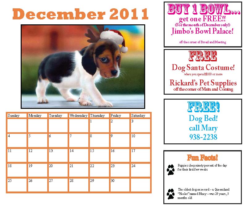
I chose the October picture because the Orange and the pumpkins reminds me of Halloween and the beginning of fall. The labs featured in November were the perfect shade
and made me instantly think that they would be perfect for November. The photo of the beagle with the Santa hat on obviously reminded me of December and Holiday cheer.
On the sides of the months are coupons for various pet supply stores that I made up.
